
The Definitive Guide for 2020
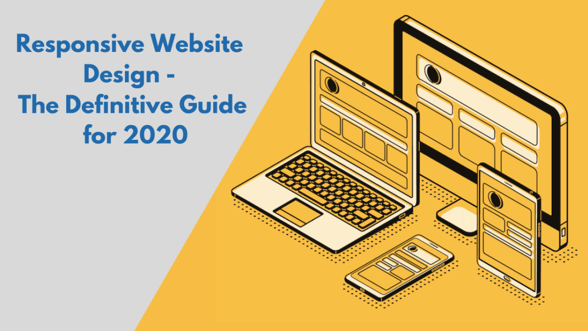
Responsive Website Design
The need of mobile devices to browse the web proceeds to expand at an immeasurable pace, however, these devices are usually restrained by display size and need a diverse approach to how content is laid out on the screen.
But, how can websites perhaps keep up with the millions of screens out there?
The answer is simple; responsive web design.

With advancing technology and latest devices, there are several screen sizes across phones, phablets, tablets, desktops, game consoles, TVs, and also wearables. Screen sizes are constantly changing, so it’s essential that your site can adjust to any screen size, now or in the future. Modern responsive design analyses all of these elements to optimize the experience for everyone who visits your website, regardless of the device.
With responsive website design, your website (plus its pages) can adjust and present the best experience to users, whether they are on their desktop, laptop, tablet, or smartphone. For that to occur, though, your website requires a responsive design.
So, what is a responsive web design, and how does it work?
In this blog, we have covered everything you need to know about responsive web design and how you can provide the best user experiences to your website visitors.
What Is Responsive Web Design?
Responsive web design defines a web design strategy that enables websites and pages to render (or display) on every device and screen sizes by automatically adjusting to the screen, whether it’s a desktop, laptop, tablet, or smartphone. Responsive web design, formerly defined by Ethan Marcotte in A List Apart, responds to the necessities of the users and the devices they are using. The layout adjusts depending on the size and abilities of the device. For instance, phone users would view the content displayed in a single column view; a tablet may display the same content in two columns.Why Responsive Web Design Matters To Web Designers And Business Owners
Responsive web design helps web designers, user interface designers, and web developers to display their websites optimally for every single different device in occurrence. It further makes the lives of company owners, marketers, and sponsors easier by ensuring the visitor experience is great, thereby increasing the conversion rate. Here are a few benefits of responsive design:One Site For Every Device
Whether seen on a 27-inch iMac with a wireless connection or from the screen of an Android phone, the website would be configured for the user’s optimal viewing comfort.Optimal Design For All The Devices
With the responsive web design method, all pictures, fonts, and additional HTML elements will be sized appropriately, maximizing whatever screen area the user has.No Need For Redirects
If you attempt to develop different variations of your website to match various screen sizes, you will have to implement various redirects. This will hamper customer experience while increasing the chances of the visitor leaving your website without browsing through it. However, by implementing a responsive design for your website, the visitor can obtain the content he needs to look at, as soon as possible, without any redirects. Responsive web design is further efficient from a price viewpoint. It’s also simpler for you to handle because it’s one site versus two. For example, if you need to make any changes on the website, you won’t have to do them twice, thereby saving money and manpower.How Does Responsive Web Design Work?
Three essential principles stimulate responsive design. Certainly, there are additional principles that come into action in some designs, but these are three that connect all responsive sites:Fluid Grid System
During the days before the internet, there was print. In print, they would define the size of what would be shown (and where) in specific measures. When the internet appeared, this trend proceeded, and websites were described in terms of pixel sizes. For the responsive web, this fixed size will not work. So we utilise the concept of comparative sizes rather than fixed ones. Let’s see an example of how this runs, applying a mathematical formula: Target size / context = relative size So say you are working on a website with a wrapper that is created to represent the site at a maximum wide of 960 pixels and the device utilises a maximum browser window width of 1280 pixels. The 960 pixels is the target size. The context is the 1280 pixels. So: 960/1280 = 75% In your CSS script, you then use these percentages and implement them to the relevant properties (width, margin, etc.)Fluid Images
The simplest way to manage fluid images (images that scale to match their container) is utilising the CSS command: img { max-width: 100%;} This informs the browser that the image needs to be a maximum 100% of its pixel value and that it must scale according to its container. The intention is that this stops an image from getting stretched when the container becomes bigger than the image – and hence excludes degradation of the image – and assures that it will adjust to the container when required, while further maintaining the original aspect proportion of the image.Media Queries
Media queries are created to modify the layout of the site when specific conditions are met. For instance, the two-column method described above may not be possible in the screen size of a smartphone. The notion is that you can then use a media query to define when the screen size needs to be rearranged. You will notice that this works great with a “mobile-first” method where you determine what you require on mobile and then from there scale-up. The CSS may look like this: @media screen and (min-width: 480px) { /* ..larger screen sizes here.. */ } You can then specify a series of these CSS instructions for each “breakpoint”. That’s when every layout becomes broken on particular screen size. You’ll require to test content to observe where breakpoints happen and plan them. Ultimately, you might find you can foretell breakpoints depending on the screen resolution of a device.Is My Website Responsive?
Responsive web design needs a bit of experimentation and training to get right. You can instantly see if a website is responsive or not in your web browser. Follow the steps mentioned below: – Open Google Chrome – Go to your website – Press Ctrl + Shift + I to start Chrome DevTools – Press Ctrl + Shift + M to toggle the device toolbar – Observe your page from a mobile, tablet, or desktop aspect Additionally, you can make use of multiple free tools available online, for example, Google’s Mobile-Friendly Test, which will help you identify if your website is mobile-friendly. To make your website mobile-friendly, you could make use of both adaptive and responsive design methods, however, responsive web design is considered more effective.Types Of Website Design
Primarily, there are two types of web design, which have been discussed at length below:Responsive Design
In its most simplistic definition, a responsive design utilizes only one layout for a web page and “responsively” adapts to properly fit the user’s screen, whether it’s a desktop, a laptop, a tablet, or a mobile phone. Technically speaking, responsive websites utilize media inquiries to target breakpoints that scale images, wrap text, and modify the layout so the site can match any screen size. It could be achieved with HTML and CSS or HTML5 and CSS3. With a responsive website, you will just need one site. Everything should seamlessly react and adjust to any user’s device or browser, this includes the layout, content, and responsive user interface.Adaptive Design
An adaptive design creates various fixed layouts that accommodate particular screen sizes. In a crux, you have many versions of a web page to match someone’s device, as opposed to a single, motionless page which seems the same across all devices. In a further technical explanation, websites created with adaptive design involve the CSS media inquiries of responsive design. Moreover, they add JavaScript-based improvements to modify the site’s HTML markup depending on the device’s abilities. This method is acknowledged as “progressive enhancement.” Adaptive does not indicate that you require two separate sites. Instead, it allows you to manage all your content in a single place and share the same content with all site visitors. Adaptive sites utilize a template primed for every device.Responsive VS Adaptive
 So, what are the essential differences between responsive and adaptive design?
In a nutshell, responsive is changeable and adjusts to the size of the screen no matter what the target device. Responsive utilizes CSS media queries to modify styles depending on the target device like the display type, width, height, etc., and just one of these is crucial for the site to adjust to different screens.
Adaptive design, on the other hand, applies static layouts based on breakpoints which don’t react once they are initially loaded. Adaptive works to identify the screen size and load the suitable layout for it – usually, you would create an adaptive site for six standard screen widths:
So, what are the essential differences between responsive and adaptive design?
In a nutshell, responsive is changeable and adjusts to the size of the screen no matter what the target device. Responsive utilizes CSS media queries to modify styles depending on the target device like the display type, width, height, etc., and just one of these is crucial for the site to adjust to different screens.
Adaptive design, on the other hand, applies static layouts based on breakpoints which don’t react once they are initially loaded. Adaptive works to identify the screen size and load the suitable layout for it – usually, you would create an adaptive site for six standard screen widths:
- – 320
- – 480
- – 760
- – 960
- – 1200
- – 1600
Web Design Elements
Web design incorporates several diverse aspects, including web page design, content production, and graphic design. Web design utilizes several of the same critical visual components as all types of design, which are often divided into visual and functional elements.Design Elements
Written Copy
This is the core of your website. Your content doesn’t just represent a significant role in your search engine ranking, it is the reason most users are visiting your website in the first place. Your website writing should be informational, clear to read, and compact. Well written web content will ensure your website design is appealing, efficient and accessible. The content should be optimized for search engines and be of a proper length, consolidating relevant keywords.Fonts
The usage of several fonts can improve website design. Many web browsers can only understand a few numbers of fonts, called “web-safe fonts”, so your designer will usually work in this extensively accepted group.Colour
The selection of colours is based on the purpose and clientele; it can be plain black-and-white to the multi-coloured scheme. The goal is to communicate the nature of a person or the brand of a company using web-safe colours.Layout
This is the plan on how the graphics, advertisements and text are arranged. In the web environment, the fundamental goal is to help the viewer find the data they seek at a glance. This involves managing the balance, flexibility, and reliability of the design.Shape
Shapes, geometric or natural, have the ability to pique a visitor’s interest. Shapes are characterized by boundaries, such as lines or colour, and they are usually used to highlight a part of the page. Everything is eventually a shape, so you need to always consider in terms of how the various components of your design are forming shapes, and how those shapes are combining.Spacing
For those who are uninformed of what white space is, it primarily is the negative space in any composition. It is an unmarked gap between two objects that ends up providing the viewer with a kind of visual break, by reducing distractions and making it simpler to concentrate on the subject at hand.Images & Icons
Graphics can incorporate logos, photos, clipart or icons, all of which improve the web design. For user-friendliness, these require to be appropriately set, operating with the colour and content of the web page, while not making it too clogged or sluggish to load.Videos
A short video about the product you provide or services you offer livens the page up. A feature video improves the user’s experience. There’s no doubt that video content is presently the most sought-after kind of content. Cashing in on this potential is undoubtedly a right choice. A video is the most engaging kind of content and as it only takes 2.6 seconds for a user’s eyes to arrive on the area that most impacts their first impression, hence, seizing their attention hook, line and sinker by a video is a good approach.Functional elements:
Navigation
Smooth navigation is a specific trick for the non-tech savvy niche of your viewers. It might be challenging to assume that such a niche exists in today’s time, but it does. And as a website creator, you have to consider this niche too. Aside from these, integrity is usually appreciated. It might be the toughest to achieve, but the outcomes are sure. Easier navigation inspires audiences to revisit your site regularly, as they identify their way around and will not be lost, discovering the things they were looking out for in the first place.Speed
Remember that your audience’s attention spread online is less than a few seconds. Research shows that it is less than 50 milliseconds. That is the total time you have to win your audience. That cannot occur if your site uses that much time to just load. You have to figure out a method where your site loads quicker than a blink. A more natural way to go around it is to add images with lesser weight so that your load time decreases and the site loads faster. Speed-optimization influences your website design. Your viewer will admire the design only if they approach it quick enough.Animations
On a standard HTML and CSS website (i.e. without Flash), animations and transformations are so apparent to overlook. And when ignored, they will usually not even be entertained at all. However, animations prove to be a great way to capture a viewer’s attention. So, if animations are essential, your best chance is to give developers an example of how they should operate so that the product performs as it should. A few of the most popular places animations crop up are in: Tooltips: Those small pop-ups when users hover over components. Image rotators: Home page slideshows are all the style, and a broad range of choices is accessible for transitions and techniques. Lightbox: You can style not just the lightbox itself, but even the transition to it.User Interactions
The main goal of the visitors is to obtain information, and if your website is capable of communicating with your users efficiently, most probably they will spend more time on your website. Methods that might work to secure smooth communication with the users are – arranging information by making great use of headlines and subheadlines, striking the waffle, and applying bullet points, rather than lengthy gusty sentences.Site Structure
Site structure relates to how you arrange your website’s content. A website usually consists of content on a type of – related – topics, exhibited on pages and posts. Site structure works with how this content is classified, linked and bestowed to the user. If you structure your website correctly, it will help from this; users will locate their way more quickly, and Google can index your URLs thoroughly. Taxonomies, such as categories and tags, and even internal links, your navigation and breadcrumbs are the means to structure your site.Cross-browser & Cross-device Compatibility
Not to be mixed with multi-browser compatible, cross-browser compatible applications and websites will be durable in every version of a browser. The capability of a site to be quickly seen across different browsers is crucial to usability for Internet users. A web application works precisely as wanted in one browser but may have other problems in another browser. So the problems will hinder the robust functionality of an application. The customers who lookout for an expert application or a website can depend on cross-browser testing which will help consumer applications in creating different results on various web browsers as they work in applets, Flash, JavaScript requests and so on.Responsive Web Design Examples
Viewing examples of responsive web design with an adaptable layout is a proper way to come to your website design plan with a clearer idea of how you desire your website to look. In particular, examining examples will assist you to do a few things.CliftonLarsonAllen LLP
 Investment, outsourcing, and tax firm CliftonLarsonAllen is a great example of visual authority on a website. You will see all three of the main versions of their responsive website centre a similar message, image, and call to action (CTA) button.
Paper & Ink Arts
 Paper & Ink Arts have all the related components on its mobile homepage as on the desktop plus tablet versions. However, because of the process, the same elements take up various amounts of space, the homepage has a part of a different feel among devices.
Bon Bon Bon
 Just like several other business websites, chocolate store Bon Bon Bon sets an image with a plain CTA front and centre. It has an image slider, so the image and CTA switch, but the CTA is continuously in a shiny red button.
The Frugal Girl
 The Frugal Girl blog keeps the logo and tagline visible at the top across website types and centres the top blog post in all three versions. The main menu becomes a hamburger menu on the smallest screen, and the information and images in the right-side menu get pushed to the bottom.
Conclusion
We are undoubtedly entering a modern era of web design and development. Far too many choices are accessible now, and there will be far too many in the near future too. These would mean adjusting and to creating custom solutions for every screen size, device and improvement in technology.
We should preferably begin a new era now: designing websites that are future-ready instantly. Knowing how to make a design responsive to the consumer doesn’t need too much training, and it is less stressful than studying how to design and code correctly for individual devices.
If you’re wondering how to create a responsive website, then TechCognate can help! We have a team of expert and skilled professionals who have launched multiple sites with effective responsive web design and development.
Feel free to contact us to speak with our experts and get started on building a great website that can help your business reach new heights of success.
